Logo Design

Logo Design

oakbend-logo.jpg

OAK BEND CHURCH

This logo was designed for a Perrysburg, Ohio church in need of a rebrand. After a few phone calls and meetings with a group of leaders from the church – we had our mission. The Oak Tree in the center of the circle is topped of with an arrow pointing up, symbolizing an uplifting message, heaven, and hope.

Looking for a logo design? Please contact us – let's see what we can develop together.

Logo Design

Forged Fitness

It's important to keep your body in shape. It's also important to keep your brand in shape. So, when a new fitness facility in Toledo, Ohio was working on its image, we went to work. This logo features hard lines, sharp corners and a big, bold look. All of these shapes come together to form a tough looking logo that you wouldn't want to run into in a dark alley. 

Looking for a logo design? Please contact us – let's see what we can develop together.

Logo Design

Chitter Chatter Ice Cream

Who doesn't love ice cream? When the owners of Chitter Chatter Ice Cream took over a cool spot on Airport Highway in Toledo, they needed a logo design. We chose cool blues and a smooth orange to represent their brand. They were provided with 2 different logo orientations and a forward and reverse color option.

Looking for a logo design? Please contact us – let's see what we can develop together.

Logo Design

Inner View Behavioral Care

Inner View needed a brand overhaul. We worked with a calming color palette and paired that with simple, geometric shapes to create a sensation of well-being, balance, and health. They were provided with 2 different logo orientations and a forward and reverse color option.

Looking for a logo design? Please contact us – let's see what we can develop together.

Logo Design

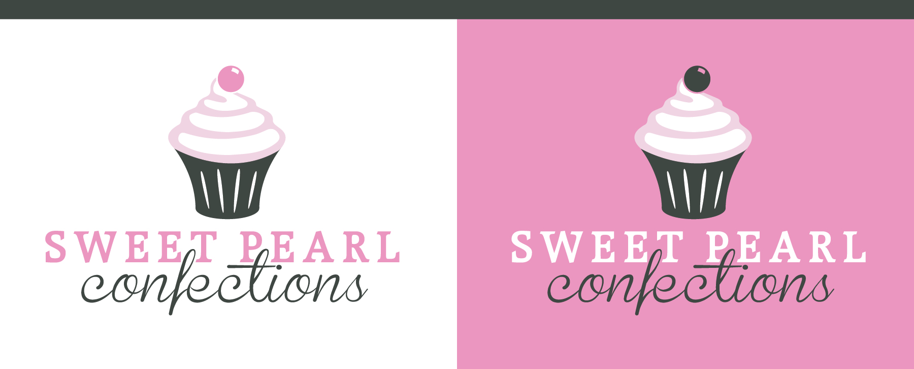
Sweet Pearl Confections

Cupcakes are a serious business. They're delicious, vicious and they are after regular cake. Sweet Pearl Confections needed a logo they could use to brand themselves as a deserving contender in the ever competitive world of cupcake artistry. We delivered a slender, sexy cupcake featuring a classic serif font and script. Hungry?

Looking for a logo design? Please contact us – let's see what we can develop together.

Logo Design

Warm & Dry Basement Systems

An established brand in the Toledo area, Warm & Dry Basement Systems was looking for a new logo for their business. Of course, we went with warm reds and yellows, and kept is simple and professional. They were provided with 2 different logo orientations and a forward and reverse color option.

Looking for a logo design? Please contact us – let's see what we can develop together.

Logo Design

Kay & Paulus Orthodontics

When Dr. Brent Paulus joined Dr. Jean Kay, they needed a new joint identity for their orthodontic practice. Working closely with both doctors and the administrative staff, we designed a versatile logo with horizontal, vertical, forward, and reverse layouts as demonstrated above. It was their goal to avoid the overdone smile and tooth depictions that are typically found in the oral health businesses. Instead, we used the actual bracket that attached to the tooth as a symbol of their company.

Looking for a logo design? Please contact us – let's see what we can develop together.

Logo Design

Glass Harbor Brewing Co.

Brewing craft beer in the glass city. Glass Harbor Brewing Co. needed a logo to represent their city of Toledo, Ohio. They chose to represent it with a local lighthouse, classic wheat laurels and clean, modern fonts. A forward and reverse color layout was provided.

Looking for a logo design? Please contact us – let's see what we can develop together.
Logo Design

Task Unlimited Concierge

When you don't have enough time, just task it! Task Unlimited Concierge needed a new look to promote their services. They run errands, clean your house and even walk the dog. They required a logo with modern femininity and bold color. We ended up with three different color options to use on various marketing materials.

Looking for a logo design? Please contact us – let's see what we can develop together.

Logo Design

Nerd Life

Let your nerd out. A local Toledo computer store wanted to appeal to the nerd in all of us. We chose to represent that with a pair of classic glasses, broken, of course. Along with a simple, but bold, font choice. The logo lent itself to two great color layouts, and both were used in several print pieces with success.

Looking for a logo design? Please contact us – let's see what we can develop together.

Logo Design

Great Black Swamp Festival of Races

The Toledo Roadrunners Club started a festival of races named for the Black Swamp area of Ohio. The city of Toledo was also represented with the frog on a lily-pad. Colors, of course, needed to be black paired with a bright swampy green. They were provided with two color variations to use in different applications.

Looking for a logo design? Please contact us – let's see what we can develop together.

Logo Design

Wiseguys Trucking

See the hidden wiseguy? Wiseguys Trucking named their business for 50's mobsters, and they wanted a logo that reflected that. Font selection, simple color choice, and making the "w" into a suit, tie, and hat wearing character all played a part in making this logo a success.

Looking for a logo design? Please contact us – let's see what we can develop together.

Logo Design

Lakeside Manufacturing

An airplane and propeller accessory manufacturing company located by a lake, the name makes a lot of sense. The light navy blue represents water and a nautical looking font was selected for Lakeside. Water was also represented in the wave section below the propeller. They were provided with 2 different color variations.

Looking for a logo design? Please contact us – let's see what we can develop together.

Logo Design

Innovative Lighting Systems

ILS came to us with a logo already designed. The problem was, it wasn't designed in a vector format. That means it couldn't be scaled to a large size without distorting. All the logos we design are in vector format, no exceptions. While we were at it, we decided to give the brand a bit of a refresh as well. This logo was designed with two different orientations, as well as a forward and reverse color option.

Looking for a logo design? Please contact us – let's see what we can develop together.

Logo Design

Alloy Fabricators

These guys cut and fabricate metal products, so we wanted a look to get that message across. We started with a rectangle proportionate to a 4x8' sheet of material. Then we added the business name in a modern, clean, professional font, and added an accent piece. The logo was then provided in a forward version with a metal gradient, as well as a black and white version.

Looking for a logo design? Please contact us – let's see what we can develop together.