
While contracting with Owens Corning, Tyler wrote and edited this inspiring video message to Owens Corning Roofing Contractors.
Baby Announcement 2
Well, Tyler and his Wife decided to have another baby – so there had to be another video. This time, their first child, Claire, is the star. Did you miss the first announcement video? Catch it here.
Logo Design
OAK BEND CHURCH
This logo was designed for a Perrysburg, Ohio church in need of a rebrand. After a few phone calls and meetings with a group of leaders from the church – we had our mission. The Oak Tree in the center of the circle is topped of with an arrow pointing up, symbolizing an uplifting message, heaven, and hope.
Looking for a logo design? Please contact us – let's see what we can develop together.
Logo Design
ASHBAUGH AERIAL
Drone videographers are popping up everywhere. This company is based in Napoleon, Ohio and specializes in agricultural aerial video. The logo features a Northern pointing arrow with a drone propeller through the middle to form an A.
Looking for a logo design? Please contact us – let's see what we can develop together.
Logo Design
SCAPESKETCH
A startup architectural firm in Toledo, OH needed a logo design. They wanted a simple, versatile setup. We went with bold black & white color, variable weight text, and a ruler graphic, which could also be interpreted as a cityscape.
Looking for a logo design? Please contact us – let's see what we can develop together.
Paul Martin & Sons Website

A Northwest Ohio based agricultural equipment sales, service and rental company. The website features responsive design, photo and brand galleries, contact forms, newsletter sign up and social media links.
Logo Design & Pixelation


Take a look at the sample logos to the left. The top logo is a vector file, and the bottom is a raster file. You can easily see the pixelation in the bottom image. If your logo is a raster file and you make it too large, it will distort. On the other hand, if your logo is a vector file, you can literally blow it up to the size of the moon. And guess what? No distortion. So why would anyone design a logo in raster? Typically, this happens when a non-professional designs a logo. Most of the time, the person who designed it just doesn't know the difference between vector and raster.
Logo Redesign
In the example to the left, ILS came to us and requested a logo re-design. They wanted this for two reasons. One, they knew they needed a vector logo because they were having some issues with distortion when applying the logo in specific areas. And two, they wanted to change a couple things like color, font, and the relative size of the objects in the logo. The image on the top is what we ended up with, as you can see, a much clearer representation of their brand.
Getting a vector logo isn't a complicated process, and it won't bust your budget either. If you want your logo to be perfectly crisp even in large format, vector is your answer. To get started today, please contact us.
Logo Design

Forged Fitness
It's important to keep your body in shape. It's also important to keep your brand in shape. So, when a new fitness facility in Toledo, Ohio was working on its image, we went to work. This logo features hard lines, sharp corners and a big, bold look. All of these shapes come together to form a tough looking logo that you wouldn't want to run into in a dark alley.
Looking for a logo design? Please contact us – let's see what we can develop together.
Salon Business Card

Muddy Maumee Website

A local community and official brand of the Maumee River. Muddy Maumee offers tank tops, t-shirts, hoodies, and accessories. The site features responsive design, a simple contact form, social media links, and e-commerce.
Logo Design

Chitter Chatter Ice Cream
Who doesn't love ice cream? When the owners of Chitter Chatter Ice Cream took over a cool spot on Airport Highway in Toledo, they needed a logo design. We chose cool blues and a smooth orange to represent their brand. They were provided with 2 different logo orientations and a forward and reverse color option.
Looking for a logo design? Please contact us – let's see what we can develop together.
Baby Announcement Video
Tyler and his Wife had a little fun with their baby announcement. They decided to see what would happen if they introduced a few new items around our house. Enjoy!
Logo Design

Inner View Behavioral Care
Inner View needed a brand overhaul. We worked with a calming color palette and paired that with simple, geometric shapes to create a sensation of well-being, balance, and health. They were provided with 2 different logo orientations and a forward and reverse color option.
Looking for a logo design? Please contact us – let's see what we can develop together.
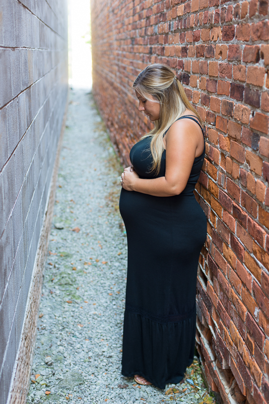
Mitch & Amber


Buckethead Barefoot Endurance Race 2015 Video
We wanted to get a unique perspective on a fun event that happens on the Maumee River. Three drones were flying over the river that day, and a gang of other camera men and women were also deployed on boats and on land. The resulting video is sure to make you want to learn to barefoot!
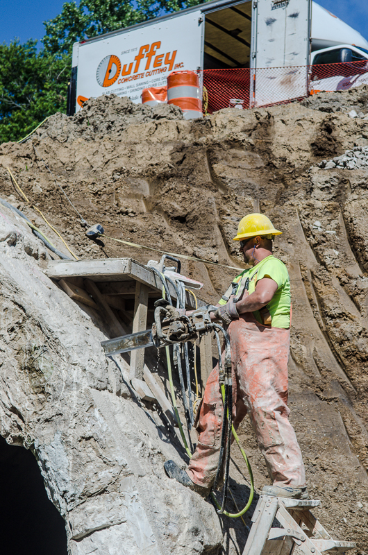
Duffey Concrete
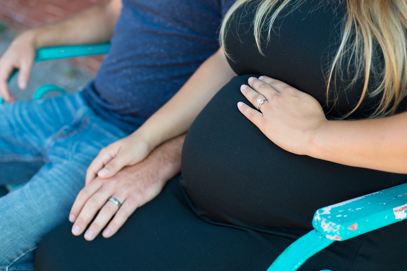
Business Session


Metroparks


Kay & Paulus Orthodontics


Kay & Paulus Stationary & Trifold


Logo Design
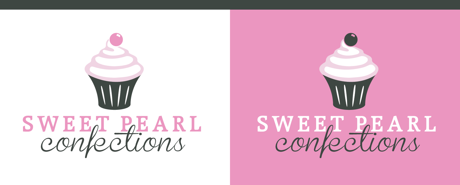
Sweet Pearl Confections
Cupcakes are a serious business. They're delicious, vicious and they are after regular cake. Sweet Pearl Confections needed a logo they could use to brand themselves as a deserving contender in the ever competitive world of cupcake artistry. We delivered a slender, sexy cupcake featuring a classic serif font and script. Hungry?
Looking for a logo design? Please contact us – let's see what we can develop together.